Check out full process & case study here.
Project overview
This web app is designed for people who have been unsuccessful, frustrated, and overwhelmed in their quest for quick recipe inspirations. It's for those who would usually stop screening endless web apps and food blogs due to overwhelmingly packed interfaces or a baffling number of options. Quite many end up reaching for their phones to order in, which gets super pricy with time, and others pop a store-bought dish in the microwave.
Both is quite comprehensible, but gets boring and pricy with time and is not always the most nutritious option.
It's also for those as well who feel pressured to meet societal expectations about lifestyle and eating choices. And last but not least, it caters for those who simply have a complicated relationship with food.
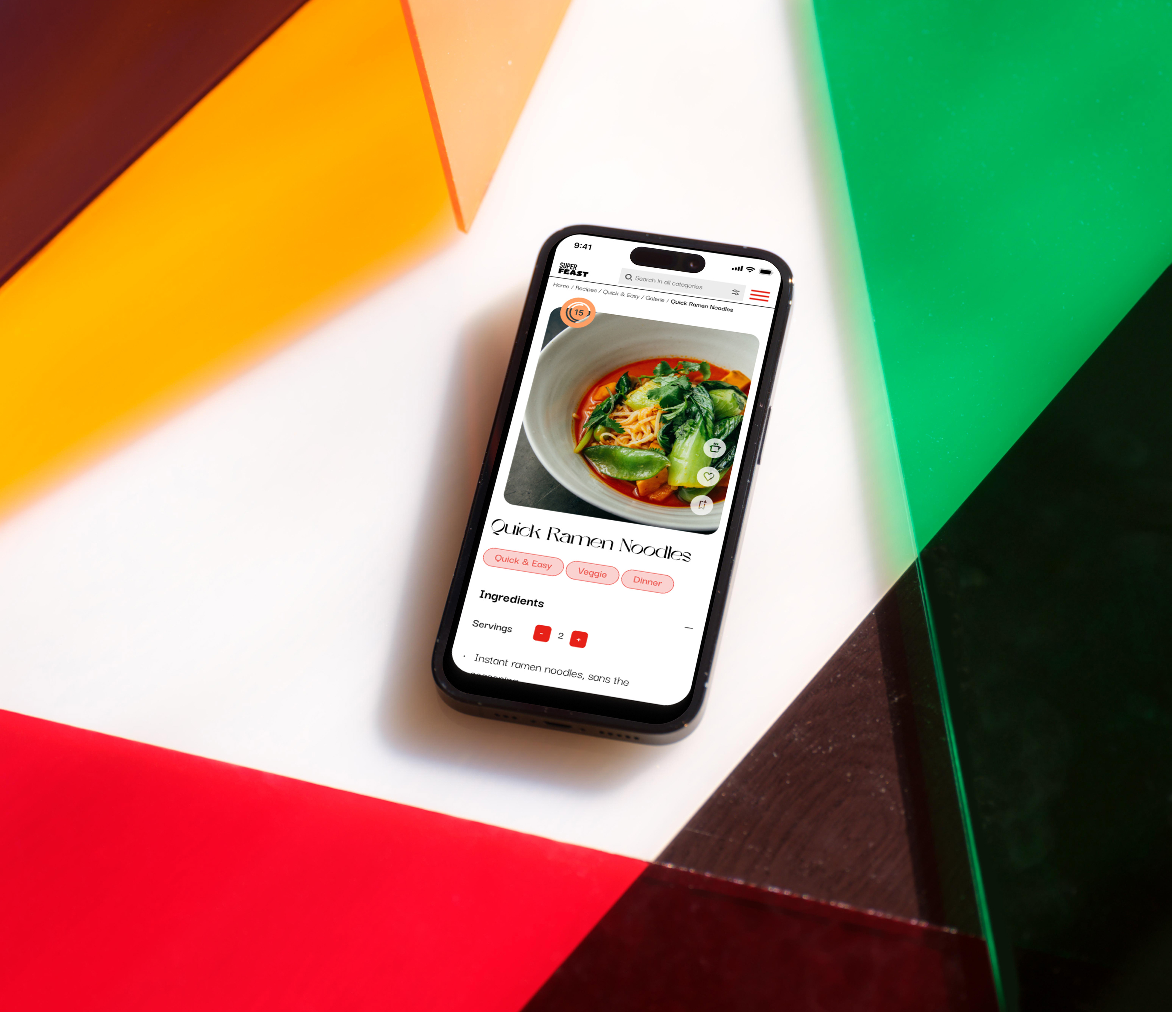
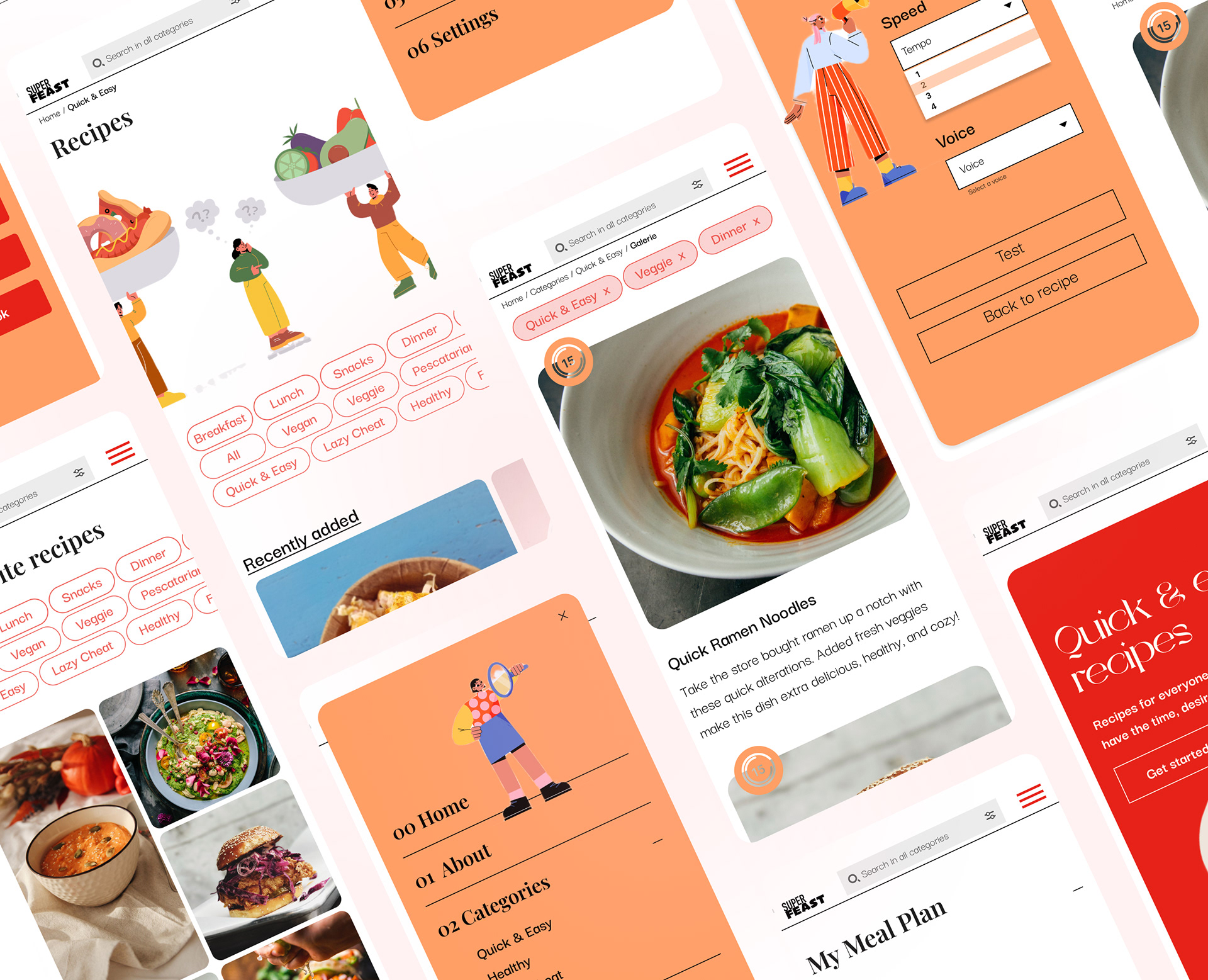
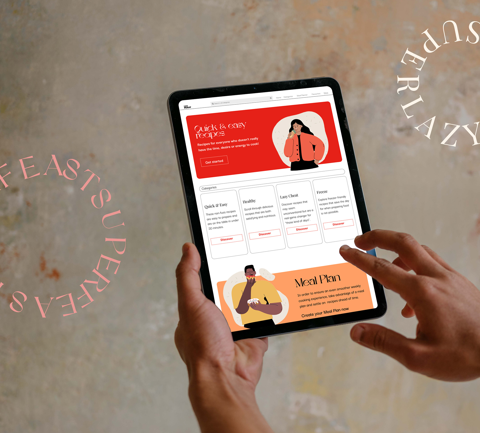
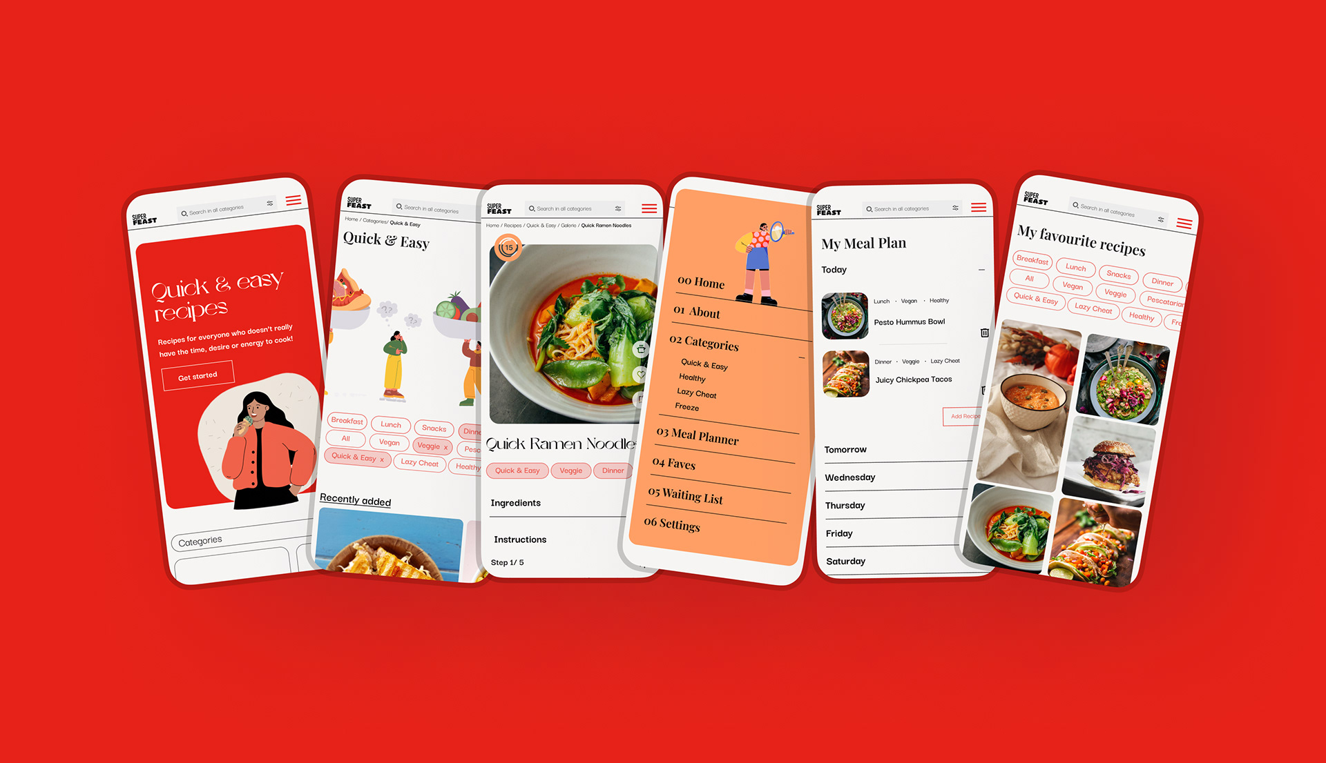
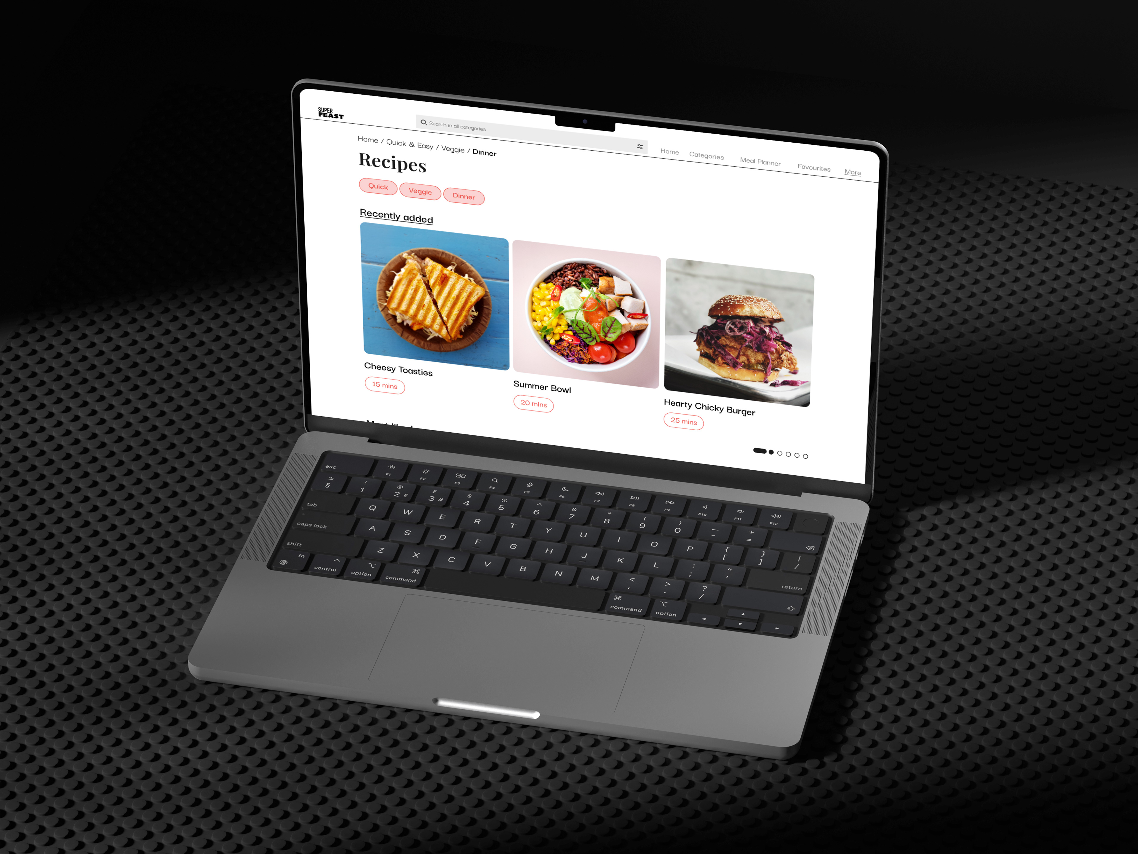
The Design
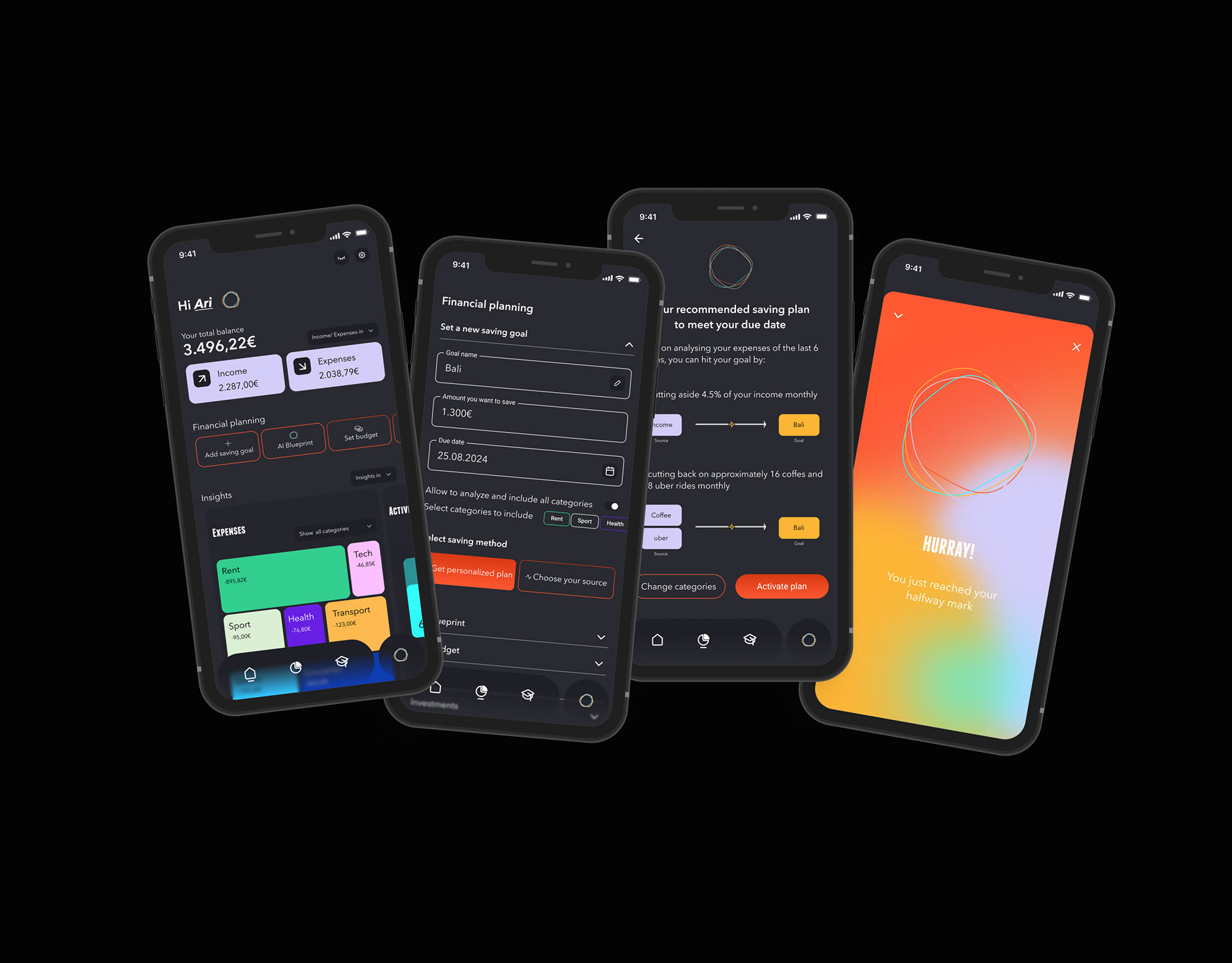
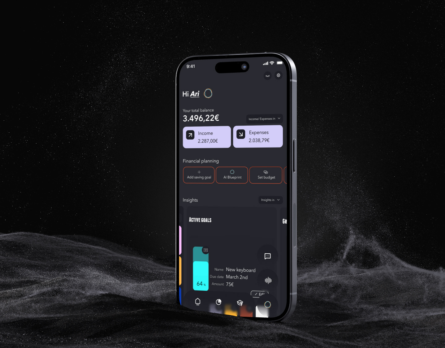
In order to bridge the gap between busy lives and healthy eating, and as my research showed especially for individuals with limited time or mental energy, I designed an app that tries to do justice to said heterogeneous group.
A sleek and clean user-friendly interface, four very clear categories and a hands-free experience with voice-enabled instructions was tested and iterated. The outcome is an app communicates kindly and shows itself proudly.
Retrospective
For me the importance of user testing, as the ongoing feedback refined my design and functionality, was one of my learning highlights. Naturally future app improvements will be closely tied to feedback from the user community.
Going forward I want this project to stay user-centric and cater to their needs. Personally, I'm passionate about adding a commenting section to foster and uphold a community where individuals can share struggles, tips, and encouragement.